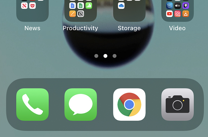
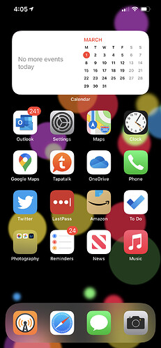
Is Apple taking the piss?
This looks terrible. I assume they scrunched up the other icons to ensure that the 2x2 widget would be square, but why not put the gap on top where it is less visible? This not only looks bad but moves the top icons farther away. Or how about making the shading around the dock a little smaller to enable another row of icons?
I’m not one to notice subtle design changes, but sweet Christmas, even I noticed this one. I’m stunned an Apple designer stood back, admired the terribly unbalanced elements on display here and thought “nailed it!”.
EDIT: Updated the thread title for clarity.
1 Like
It’s the page indicator area. When you have multiple pages you can also swipe on this to quickly get to the page you want.
1 Like
The gap was there in iOS 13 too, but slightly taller in iOS 14. The page indicator has vertically centred though.
I understand the page indicator is located there, and was located there previously. My point is that the space there is has noticeably increased, by nearly half the height of an icon row. It makes me wonder if one or more of the upcoming iPhones will have new resolutions that allow for an additional row of icons. In the meantime, I guess this is just an annoyance I’ll have to endure; a little poke in the eye every time I pick up my phone.
It’s probably there to give space for you to touch to add widgets without having to select “Edit Home Screen” on an app.
1 Like
I noticed that too, and it bothers me.
1 Like
Five months of daily use and this still looks terrible to me.
Seems okay to me.
What I have issues with is iPadOS restricting widgets to the left side of the first Home Screen
The lack of widgets on iPad was certainly a surprise; ditto for the lack of the new all apps list and option to dump new apps into folders automatically. I’m hoping this comes in the next version, along with some improvements to multi-tasking. Honestly I’d like to see a complete rethink of multi-tasking.
1 Like


